
Ali vs Web Design
on Thursday, January 30, 2014
When I think of design as it relates to the internet, I think of the interactions users will experience. Some sites do a really great job of concisely presenting information to the user. And they work well on screens that are way too big or a little too small. With this in mind, I wanted to learn more about desiging for the web.
Disclaimer: I am not a designer. Continue reading at your own risk…or something like that.
I played with design on a little web app I built to play Billboard charts as YouTube playlists. I relied heavily on the Golden Grid System to create the web app’s design. The Golden Grid System isn’t a traditional CSS framework; it’s more of a guideline or a set of rules to building responsive websites. I was able to apply the Golden Grid System to the web app, but I used it more as a framework than a guideline. I knew with another chance, I could right this wrong. Fortuantely for you (and me), I also wanted to spin up a new blog. You’re looking at my second attempt at using the Golden Grid System!
In the Golden Grid System, the screen is divided into 18 evenly split columns. The two outermost columns are reserved to be the outside margins of your layout. That leaves 16 columns to play with, but a 16 column layout is really meant for the largest screens. When working with smaller screens, columns are combined to create less overall columns. Sometimes pictures, even crudley drawn pictures, are better than words.
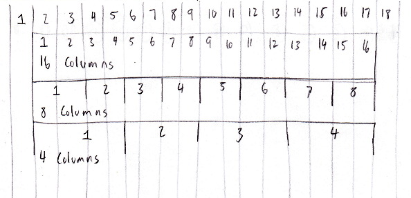
The columns are generally combined in half steps. From 16 columns, we come down to eight columns. Then, from eight columns to four. On a small screen like a phone, you would probably use a four column layout. As the screen size increases, you can utilize more columns. More space, more columns.
Then, there’s the baseline grid. I never knew about baseline grids, but my Google-Fu tells me it’s not a new idea. A typical baseline grid has you at a base font-size of 16px and a base line-height of 24px. So your text would have to fit within the 24px line-height. My interpretation of the baseline grid within the Golden Grid System had me fitting content inside rows of the grid. For example, the text of blog’s header doesn’t quite fit in three rows of the grid.
So I force the text to take up the rest of the row it overflows into. I also add another row to add some more space between the header and the rest of the document.
In addition to the baseline grid, the Golden Grid System also introduces a zoomable baseline grid. If everything in the stylesheet is defined in ems, font sizes can adjust as the screen size changes and everything should change proportionately (except for a few rounding errors). I didn’t try implementing a zoomable baseline grid because I had just learned baseline grids were a thing. Something to try later, I guess.
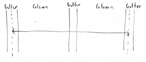
The other big piece to the Golden Grid System are elastic gutters. Gutters represent the space between columns. The gutters in the Golden Grid System are considered elastic because their widths are relative to page’s font-size and not the screen’s width. Since font sizes are specified as ems in the stylesheet, content can transition smoothly as the screen size changes.
Elastic gutters are still a little mysterious to me, but as I understand it they are created by placing a wrapper around content. The wrapper has left and right paddings that are half the gutters’ width. For example, if I have content that needs to fit within two columns, I would place a wrapper around the content that is two columns wide. Assuming I set my gutters to be 1.5em wide, the wrapper’s left and right padding would be 0.75em. This has the effect of centering the content between the two gutters.
That’s the jist of the Golden Grid System…as I understand it anyways. Take a look at the Golden Grid System’s website and play around with it. There’s a hamburger menu in the top right corner; this is the Golden Gridlet. It’s a little bit of JavaScript that overlays a basic grid layout on top of the page. Its useful for seeing how things fit within the grid. I used it a lot when I was building this blog.
Now that everyone knows what the Golden Grid System is, we can take a look at what I came up with.
Here is the blog’s main stylesheet. It’s written using Sass (Sass makes this whole thing tolerable). The stylesheet starts with a lot of variables and presets. Scroll a little bit and you’ll see the wrapper and the first gird sighting. The first layout I define is the four column layout because I’m desiging Mobile First™. The four column layout will generally be pretty simple because there’s only so much you can do with limited space. Shrink your browser window and inspect the blog’s html (go ahead, I’ll wait). Compare it to the stylesheet so far and you’ll see there’s not a lot of magic going on.
Things get a little more interesting when you make your window bigger (I would tell you to make it bigger, but I know you never shrank it to begin with). The first thing you’ll notice is a change in the header. The text will move from bellow my beautiful face and line up magically next to me. I split the content of my header into left and right divs; left for me and right for the text. Since I defined each element to float left, they will naturally sit next to each other. The header should appear misaligned given my header rules, but it doesn’t thanks to magic of CSS media queries. You can see media queries in action towards the end of the four column layout definition. The margins of both the left and right header divs change so the divs will be aligned when they are sitting next to each other. That happens when the screen is wider than 455px.
Media queries are used again to define the eight column layout. 984px is my arbriatry breakpoint when the eight column layout will be used. Now that I have more space, my content doesn’t need take up so much of the screen and I can add few more columns to the outside margins.
I skipped over designing a 16 column layout. I’m not using a large enough screen, so it would be hard for me to design. I also doubt you’ll be reading this on your living room TV.
…and that’s my stylesheet!
The blog’s design is pretty simple, and that’s by design. The most important thing on a blog are the posts. If nothing else, they should be legible. I think I accomplished that with this design, but please let me know if I’m wrong. Seriously. If you missed the disclaimer earlier, I’m not a designer. I’m flying by the seat of my pants!